MAven revamp

The Challenge

The Maven app faced challenges with branding consistency, usability, and accessibility, resulting in a fragmented user experience. Key tasks like claim submissions and policy access felt unintuitive, affecting user satisfaction. Our goal was to rebuild the app with a focus on clarity, consistency, and seamless usability to deliver a refined and reliable experience.

Duration

Team

Tools

Research & Insights

Research & Insights

Understanding users

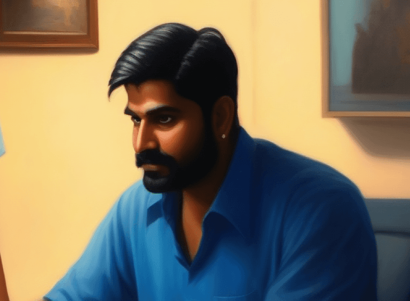
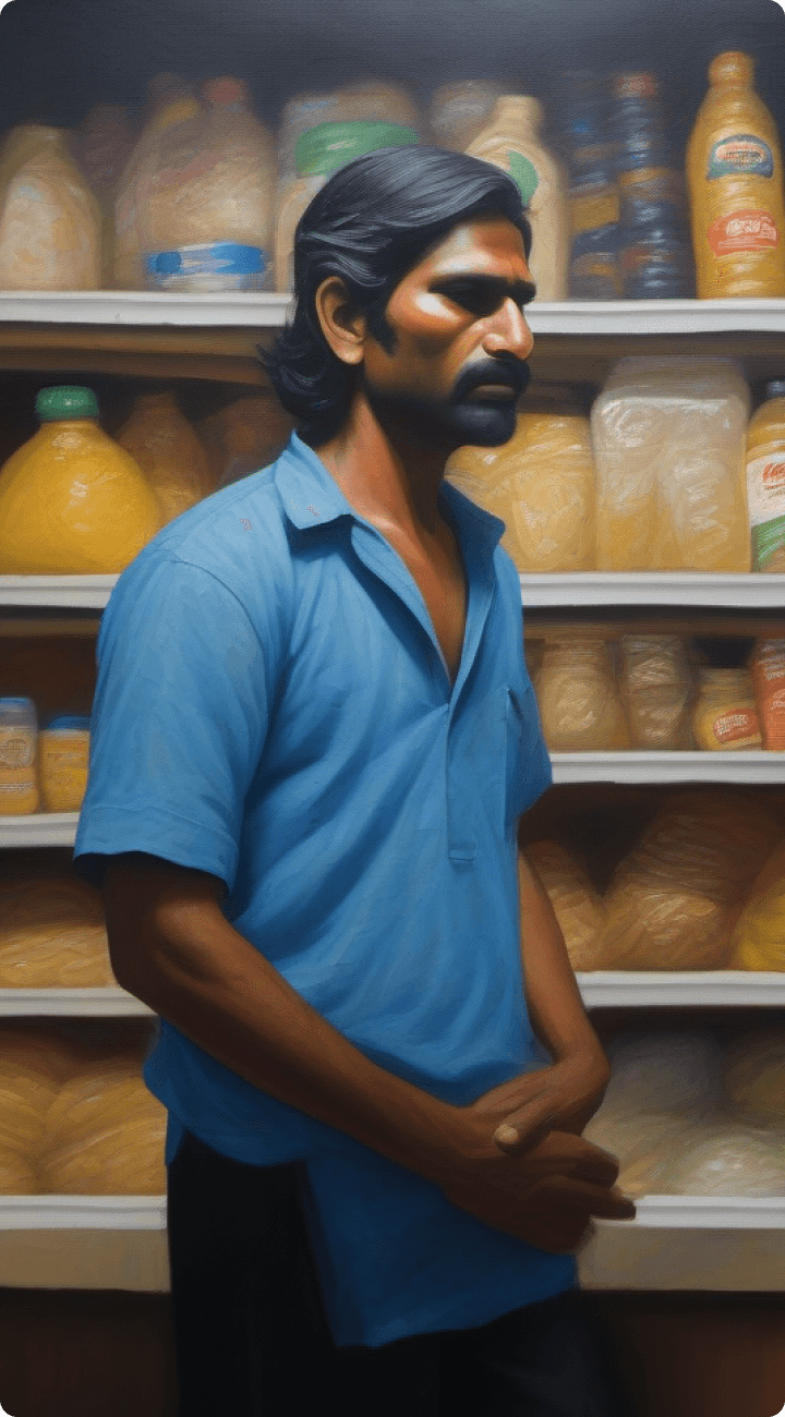
Ramesh Gupta, 34 M

Small Business Owner in Bengaluru

Ramesh manages a grocery store and values efficiency due to his busy schedule. Insurance is essential for him to protect his family, and he seeks a simple, hassle-free way to manage claims and policies.

Goals

  • Quickly submit and track claims.

  • Easily access policy details and benefits.

  • Manage his family’s insurance with minimal effort.

Pain points

  • Finds insurance processes time-consuming and complex.

  • Lacks clarity on next steps after submitting a claim.

  • Struggles to understand detailed policy terms.

Tech comfort level

Intermediate; comfortable with mobile apps but prefers intuitive, straightforward interfaces.

Priya Sharma, 29 F

Software Developer in Hyderabad

Rajesh Kumar, 41 M

Factory Worker in Pune

Ramesh Gupta, 34 M

Small Business Owner in Bengaluru

Ramesh manages a grocery store and values efficiency due to his busy schedule. Insurance is essential for him to protect his family, and he seeks a simple, hassle-free way to manage claims and policies.

Goals

  • Quickly submit and track claims.

  • Easily access policy details and benefits.

  • Manage his family’s insurance with minimal effort.

Pain points

  • Finds insurance processes time-consuming and complex.

  • Lacks clarity on next steps after submitting a claim.

  • Struggles to understand detailed policy terms.

Tech comfort level

Intermediate; comfortable with mobile apps but prefers intuitive, straightforward interfaces.

Priya Sharma, 29 F

Software Developer in Hyderabad

Rajesh Kumar, 41 M

Factory Worker in Pune

Ramesh Gupta, 34 M

Small Business Owner in Bengaluru

Ramesh manages a grocery store and values efficiency due to his busy schedule. Insurance is essential for him to protect his family, and he seeks a simple, hassle-free way to manage claims and policies.

Goals

  • Quickly submit and track claims.

  • Easily access policy details and benefits.

  • Manage his family’s insurance with minimal effort.

Pain points

  • Finds insurance processes time-consuming and complex.

  • Lacks clarity on next steps after submitting a claim.

  • Struggles to understand detailed policy terms.

Tech comfort level

Intermediate; comfortable with mobile apps but prefers intuitive, straightforward interfaces.

Hide persona

Priya Sharma, 29 F

Software Developer in Hyderabad

View persona

Rajesh Kumar, 41 M

Factory Worker in Pune

View persona

Understanding user journey

Ramesh experiences sudden abdominal pain while managing his grocery store. Painkillers don’t help, prompting an urgent hospital visit.

Pain Point: No clarity on which hospitals nearby offer cashless insurance services.

1

Ramesh searches online for cashless hospitals covered under his insurance but struggles to locate a reliable and updated list.

Pain Point: Lack of an easily accessible, insurer-verified hospital network on his app.

2

After consultation, the doctor recommends immediate surgery, and the hospital begins the pre-authorization process with the insurer.

Pain Point: Ramesh feels uncertain about the document requirements and whether his insurer will approve the claim in time.

3

Ramesh, already stressed, asks his wife to gather and submit documents to the hospital. The hospital raises the pre-authorization request with the insurer.

Pain Point: Lack of guidance in the app about required documents and the progress of the pre-authorization process.

4

Ramesh, already stressed, asks his wife to gather and submit documents to the hospital. The hospital raises the pre-authorization request with the insurer.

Pain Point: Lack of guidance in the app about required documents and the progress of the pre-authorization process.

4

After surgery, Ramesh waits for insurance approval. Once approved, he reviews deductions and pays the out-of-pocket expenses before discharge.

Pain Point: Uncertainty about the approval timeline and lack of clarity on deductions, leading to unexpected financial stress.

5

Analysing heuristics of current app

Visibility of system status

Keep users informed about what is going on, through feedback within a reasonable amount of time.

2

Violations

Visibility of system status

Keep users informed about what is going on, through feedback within a reasonable amount of time.

2

Violations

User control and freedom

Users should have "emergency exit" to leave the unwanted action in case of a mistake.

3

Violations

User control and freedom

Users should have "emergency exit" to leave the unwanted action in case of a mistake.

3

Violations

Consistency and Standards

Users should not have to wonder whether different words, situations, or actions mean the same thing.

4

Violations

Consistency and Standards

Users should not have to wonder whether different words, situations, or actions mean the same thing.

4

Violations

Aesthetic and Minimalist Design

Every extra unit of information in a dialogue competes with the relevant units of information and diminishes their relative visibility.

3

Violations

Aesthetic and Minimalist Design

Every extra unit of information in a dialogue competes with the relevant units of information and diminishes their relative visibility.

3

Violations

Building the Design System

Building the Design System

Current MAven screens

Current design system was not aligned to MediAssist’s brand identity.

Current MAven screens

Current design system was not aligned to MediAssist’s brand identity.

Current Mediassist branding

All user facing products had blue theme

Current Mediassist branding

All user facing products had blue theme

Current design system was not aligned to MediAssist’s brand identity. We began by creating a design system using our selected color palette. As the app grew, more components were added to maintain consistency and streamline the design process.

Noto Sans

Regular

Medium

Semibold

Bold

ABCDEFGHIJKLMNOPQRSTUVWXYZ
abcdefghijklmnopqrstuvwxyz
0123456789 !@#$%^&*()

ABCDEFGHIJKLMNOPQRSTUVWXYZ
abcdefghijklmnopqrstuvwxyz
0123456789 !@#$%^&*()

White #FFFFFF

Grey-Dark #334155

Grey-Light #8896A9

Brand #2563EB

Accent Lime #B1EB9B

Accent Pink #FBCFE8

Label

Label

Label

Label

Label

Label

Label

Label

Label

Label

Label

Label

Filtering & Structuring Data

Filtering & Structuring Data

Introduction of user stories to prioritise customer features/pain points

Filtering data to show only what's needed

Affinity mapping to respective buckets

Creating user flow

Iteration and Refinement

Iteration and Refinement

Rigorous UI Testing

We conducted comprehensive UI and UX testing for each component and screen, eliminating bugs and ensuring a smooth user interface.

Rigorous UI Testing

We conducted comprehensive UI and UX testing for each component and screen, eliminating bugs and ensuring a smooth user interface.

Research and Scope Definition

We worked closely with the product team to conduct research and define the scope of each feature, ensuring that all design decisions were informed by data and user needs.

Research and Scope Definition

We worked closely with the product team to conduct research and define the scope of each feature, ensuring that all design decisions were informed by data and user needs.

Gathering internal and external feedback

Internal testing was conducted to ensure that only the best design solutions were implemented. Continuous user feedback was gathered to track the performance and reception of new features.

Gathering internal and external feedback

Internal testing was conducted to ensure that only the best design solutions were implemented. Continuous user feedback was gathered to track the performance and reception of new features.

Final design

Final design

  1. Responsive design

Previous version of app was not desktop ready, so it was having excess of negative space which was hiding important information on scroll.


  1. Personalised homescreens

Dynamic homescreens according to various usecases. Entire order of homepage changes based on the usecase as well.

1

Standard Home Screen

The primary interface presents users with insurance details, claim statuses, and recent activities, offering easy access to essential features.

2

Enrollment-Focused Home Screen

Highlights the enrollment process with key dates and step-by-step guidance to prompt timely user actions and ensure coverage awareness.

3

Upcoming Hospitalization Home Screen

Displays information relevant to upcoming hospital visits, including pre-admission details and essential guidelines to prepare users effectively.

4

Post-Discharge Home Screen

Shows discharge details and provides options for adding pre and post-treatment claims, helping users manage and complete treatment documentation.

  1. Major screens and changes

  1. Major screens and changes

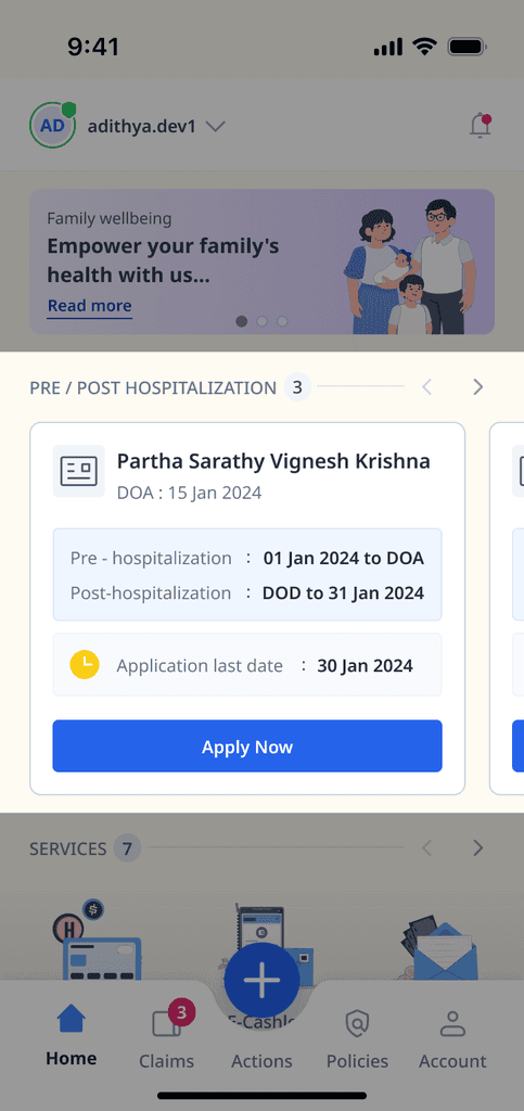
Home screen

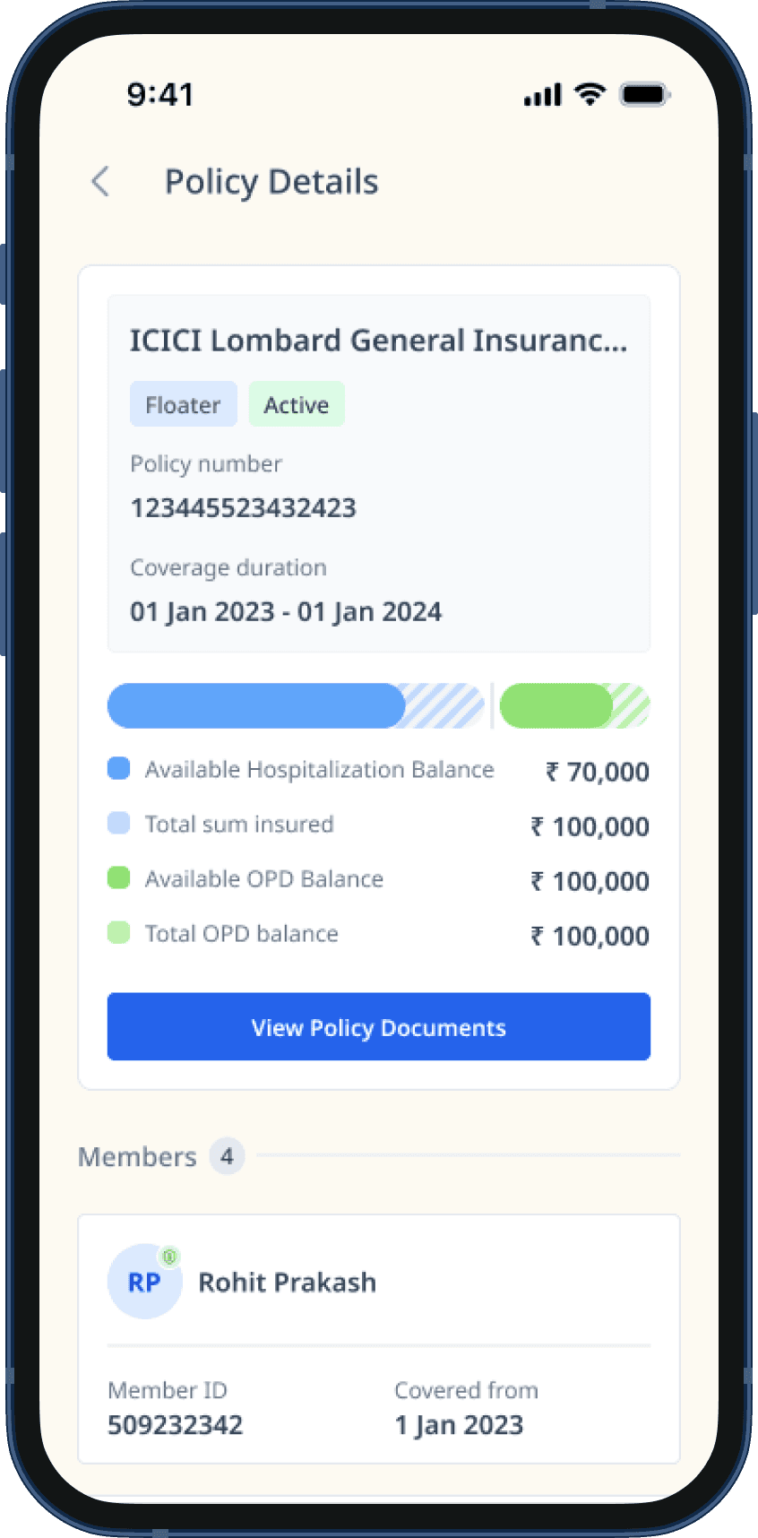
Many segments have transitioned to a horizontal scroll, and when more than a single entry is concealed, it reflects in the counts. Additionally, navigation buttons have been provided for screen readers to emphasize them.

Claim list

CTAs are provided to let members know if any vital tasks are to be finished.

Claim details

We display statuses upfront, and in cases where a member must perform several tasks, we emphasize this in the update section in advance.

Bills

The primary source of discontent for our members arises when they purchase an insurance policy, anticipating that it will cover all costs, only to find that they still have to pay additional fees. Furthermore, the reasons for certain deductions are often not adequately clarified. To address this, we have begun providing a detailed explanation for these deductions, improving the transparency of our processes.

Sharing an intimation with TPA

Previously, the form often navigated to a new page for supplementary data entry. We've now segmented it into stages and granted members enhanced capability to pick preferred treatments, medical facilities, and the like, as well as look up relevant ones.

Impact and results

Impact and results

Read more

Read more

"Great things" take "time"

"Great things" take "time"

Create a free website with Framer, the website builder loved by startups, designers and agencies.