Me@titan Employee Portal Revamp

Me@titan Employee Portal Revamp

Challenge

The ME@Titan portal needed a redesign to address outdated interfaces, unclear data representation, and missing key functionalities. Employees struggled with accessing documents (45% reported difficulty), redeeming discount coupons (38% faced errors during redemption), and managing assets (41% found the process cumbersome). HR professionals also faced challenges in efficiently managing resumes (50% reported inefficiencies).

Duration

Team

Tools

Research & insights

Understanding users

This will help us understand why users are not using the app that much

Ananya Sharma, 28 F

Sales executive in Bengaluru

Ananya is a mid-level employee who frequently uses the Me@Titan portal to access documents, redeem discount coupons, and manage her assigned assets. She often juggles multiple tasks and expects the portal to be fast, responsive, and easy to use.

Goals

  • Quickly access personal and company-related documents.

  • Easily redeem and track discount coupons.

  • Manage and track assets without delays.

Pain points

  • Struggles with slow navigation and unclear data representation in the portal.

  • Finds it challenging to redeem coupons due to technical glitches.

  • Overwhelmed by cluttered interfaces when trying to locate specific information.

Tech comfort level

Intermediate; comfortable with digital platforms but prefers simple and guided user interfaces.

Ananya Sharma, 28 F

Sales executive in Bengaluru

Ananya is a mid-level employee who frequently uses the Me@Titan portal to access documents, redeem discount coupons, and manage her assigned assets. She often juggles multiple tasks and expects the portal to be fast, responsive, and easy to use.

Goals

  • Quickly access personal and company-related documents.

  • Easily redeem and track discount coupons.

  • Manage and track assets without delays.

Pain points

  • Struggles with slow navigation and unclear data representation in the portal.

  • Finds it challenging to redeem coupons due to technical glitches.

  • Overwhelmed by cluttered interfaces when trying to locate specific information.

Tech comfort level

Intermediate; comfortable with digital platforms but prefers simple and guided user interfaces.

Hide persona

Rajiv Nair, 35 M

Senior HR manager in Mumbai

Rajiv oversees talent management and employee engagement activities. He frequently uses the Me@Titan portal for reviewing resumes, managing policy documents, and tracking employee requests.

Goals

  • Access and update HR policy documents seamlessly.

  • Track employee requests for assets and approvals without delays.

  • Generate quick reports for employee engagement activities.

Pain points

  • Spends excessive time navigating through poorly structured data.

  • Faces inconsistencies in policy document access.

  • Limited ability to generate customized reports easily.

Tech comfort level

Advanced; comfortable using enterprise-level tools but expects intuitive workflows and robust functionality.

Rajiv Nair, 35 M

Senior HR manager in Mumbai

Rajiv oversees talent management and employee engagement activities. He frequently uses the Me@Titan portal for reviewing resumes, managing policy documents, and tracking employee requests.

Goals

  • Access and update HR policy documents seamlessly.

  • Track employee requests for assets and approvals without delays.

  • Generate quick reports for employee engagement activities.

Pain points

  • Spends excessive time navigating through poorly structured data.

  • Faces inconsistencies in policy document access.

  • Limited ability to generate customized reports easily.

Tech comfort level

Advanced; comfortable using enterprise-level tools but expects intuitive workflows and robust functionality.

Hide persona

Understanding domain

Why does a user want to use this portal?

Document Access & Management

Employees access salary slips, tax documents, policy handbooks & other documents.

Benefits & Policy Management Design

View and manage insurance policies, health benefits, and other employee perks.

Access employee specific coupons

Coupons are available for various titan products for employees to use and redeem

Asset Management to understand asset utilisation

Track asset allocation, return, and reimbursement status.

Recruitment & Resume Management

HR professionals manage recruitment pipelines and review resumes efficiently.

Configure banners, widgets and notifications

Admin can configure banners, widgets and notification which is specific to each group

Requirement gathering and prioritization

Initial requirements were provided via email, followed by independent research to deepen our understanding. We prioritized screens to ensure coverage of all versions and developed a comprehensive information architecture to guide the project.

Requirement gathering and prioritization

Initial requirements were provided via email, followed by independent research to deepen our understanding. We prioritized screens to ensure coverage of all versions and developed a comprehensive information architecture to guide the project.

Creating user flow

Mapping current user flow, to make sure we don't miss any flow

Creating user flow

Mapping current user flow, to make sure we don't miss any flow

Heuristics on current app

This will help us understand why users are not using the app that much

User control and freedom

Users should have "emergency exit" to leave the unwanted action in case of a mistake.
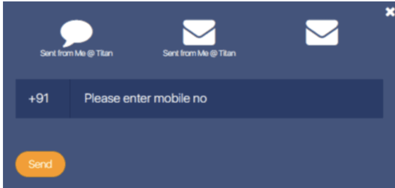
Description of Violation
Recommendation
Severity Rating
Screenshot/Link

User is unable to identify selection of mobile, email or other and what it means

Seperate tabs should be there to allow user to clearly select and share their code

2
Description of Violation

User is unable to identify selection of mobile, email or other and what it means

Recommendation

Seperate tabs should be there to allow user to clearly select and share their code

Severity Rating
2
Screenshot/Link

Most of the cards do not have clear navigation

Cards should have clear navigation so user do not get stuck on a page/flow

2
Description of Violation

Most of the cards do not have clear navigation

Recommendation

Cards should have clear navigation so user do not get stuck on a page/flow

Severity Rating
2
Screenshot/Link

Consistency and Standards

Users should not have to wonder whether different words, situations, or actions mean the same thing.
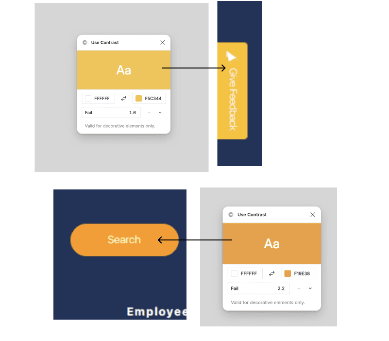
Description of Violation
Recommendation
Severity Rating
Screenshot/Link

Text on buttons are not readable

Texts should have minimum contrast of 4.5+ to be readable

3
Description of Violation

Text on buttons are not readable

Recommendation

Texts should have minimum contrast of 4.5+ to be readable

Severity Rating
3
Screenshot/Link

Icons style and size vary a lot within the app

Icon styles should remain similar to be perceivable as connected experience

2
Description of Violation

Icons style and size vary a lot within the app

Recommendation

Icon styles should remain similar to be perceivable as connected experience

Severity Rating
2
Screenshot/Link

Card style and size vary a lot within the app

Card styles should remain similar to be perceivable as connected experience

2
Description of Violation

Card style and size vary a lot within the app

Recommendation

Card styles should remain similar to be perceivable as connected experience

Severity Rating
2
Screenshot/Link

Aesthetic and Minimalist Design

Every extra unit of information in a dialogue competes with the relevant units of information and diminishes their relative visibility.


Description of Violation
Recommendation
Severity Rating
Screenshot/Link

Asset utilisation and graph is not very clear to user

Clear legends should be used along with numbers, and this can be designed in a clean and minimal way.

2
Description of Violation

Asset utilisation and graph is not very clear to user

Recommendation

Clear legends should be used along with numbers, and this can be designed in a clean and minimal way.

Severity Rating
2
Screenshot/Link

Design process

Design Iterations

A key issue was the outdated page design and unintuitive flows. We began with quick paper sketches and whiteboard sessions involving stakeholders to gather feedback and secure initial approval, setting a strong foundation for iterative improvements.

Design Iterations

A key issue was the outdated page design and unintuitive flows. We began with quick paper sketches and whiteboard sessions involving stakeholders to gather feedback and secure initial approval, setting a strong foundation for iterative improvements.

Design Iterations

A key issue was the outdated page design and unintuitive flows. We began with quick paper sketches and whiteboard sessions involving stakeholders to gather feedback and secure initial approval, setting a strong foundation for iterative improvements.

Wireframing and Client Approval

Initial Wireframes: We began with creating wireframes to map out the new user flows and data representations. These wireframes were shared with the client for feedback.
Approval and Iteration: After several rounds of feedback and adjustments, we obtained client approval, ensuring all necessary features and data points were included.

Wireframing and Client Approval

Initial Wireframes: We began with creating wireframes to map out the new user flows and data representations. These wireframes were shared with the client for feedback.
Approval and Iteration: After several rounds of feedback and adjustments, we obtained client approval, ensuring all necessary features and data points were included.

Design system

We began by creating a design system using our selected color palette. As the app grew, more components were added to maintain consistency and streamline the design process. Tiffany Blue is selected to adhere to brand guidelines, while secondary colors are chosen to complement the primary color, enhancing its aesthetic appeal and providing contrast for design

Design system

We began by creating a design system using our selected color palette. As the app grew, more components were added to maintain consistency and streamline the design process. Tiffany Blue is selected to adhere to brand guidelines, while secondary colors are chosen to complement the primary color, enhancing its aesthetic appeal and providing contrast for design

Design solutions

Home screen

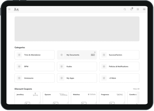
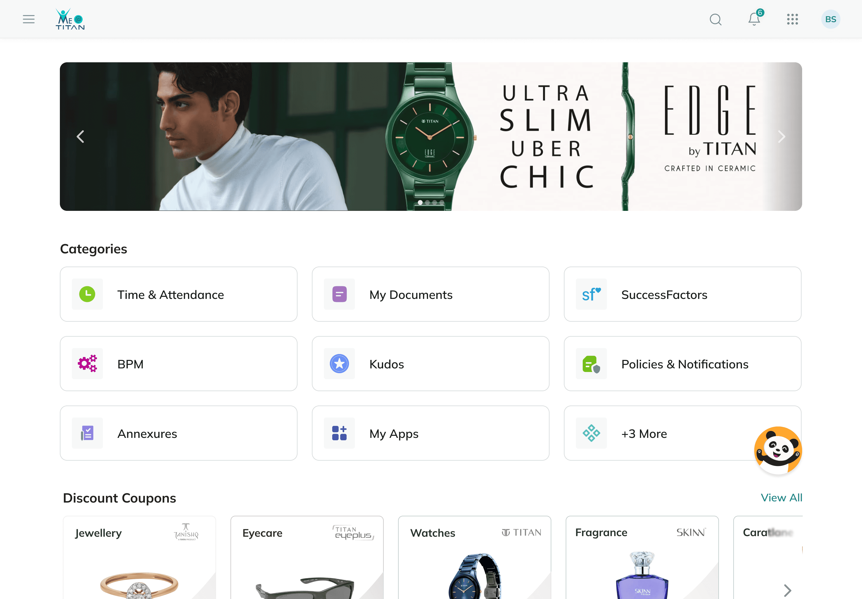
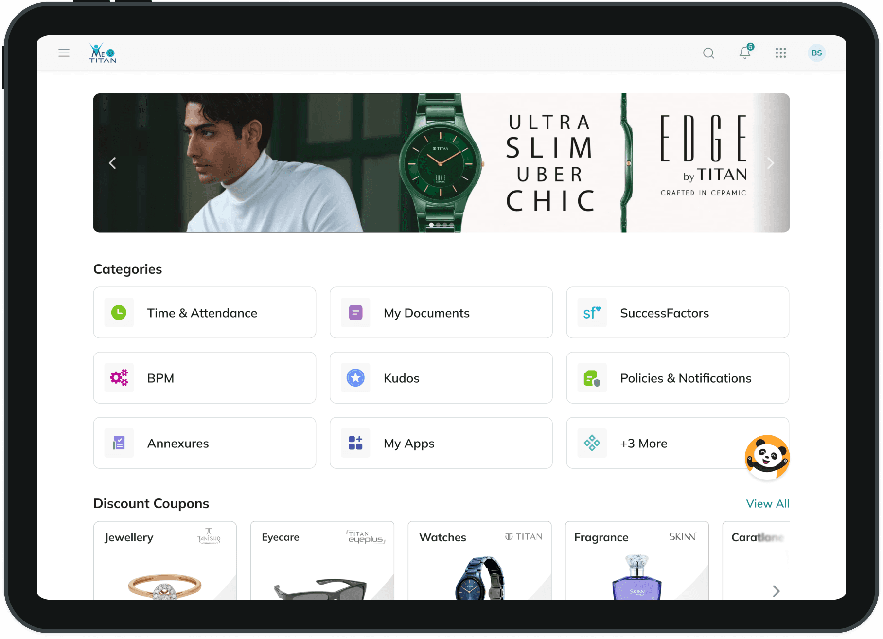
Every essential shortcut/widget required by the user is displayed on the homepage. We've consolidated all coupons by category, so users can see the total amount redeemed.

Discount coupons

Customers are able to effortlessly sift through coupons by brand, opting to either share the coupon directly on social media or copy the code for use on checkout pages. Coupons that have already been redeemed are clearly indicated to prevent inadvertent usage attempts by the customer.

Asset at residence

This is the central interface of this web application, visitors can monitor their quota and usage. After settling payments and clearing arrears, they have the option to eliminate due amounts and expand their quota.

Documents

Every staff-related paperwork can be found here, sorted according to categories and accompanied by unique symbols to aid users in locating them swiftly. We've incorporated advanced search filters and a list display for enhanced adaptability.

Final result

Previous design were mobile friendly but not built to make use of extra space in desktop view

Conclusion

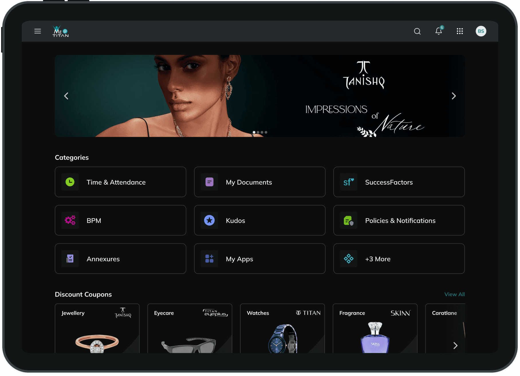
The revamped Me@Titan portal successfully enhanced the user experience, delivering a clear and intuitive interface for accessing documents, redeeming coupons, and managing assets. The implementation of dynamic font sizes and a dark mode version further improved accessibility and usability. Through close collaboration between the design and development teams, we delivered a pixel-perfect product within a tight two-month timeline.

After the redesign, these issues significantly improved:

  • Document access errors reduced to 10%

  • Coupon redemption errors dropped to 8%

  • Asset management issues decreased to 12%

  • Resume management efficiency increased by 60%

This project highlights the importance of iterative design, client collaboration, and effective teamwork in successfully addressing complex user challenges and delivering a seamless digital experience for both employees and administrators.

Read more

"Great things" take "time"

"Great things" take "time"

Create a free website with Framer, the website builder loved by startups, designers and agencies.